Skarp
Sharp, bold and clear. A light design where the company’s brand colour fills large, solid areas.
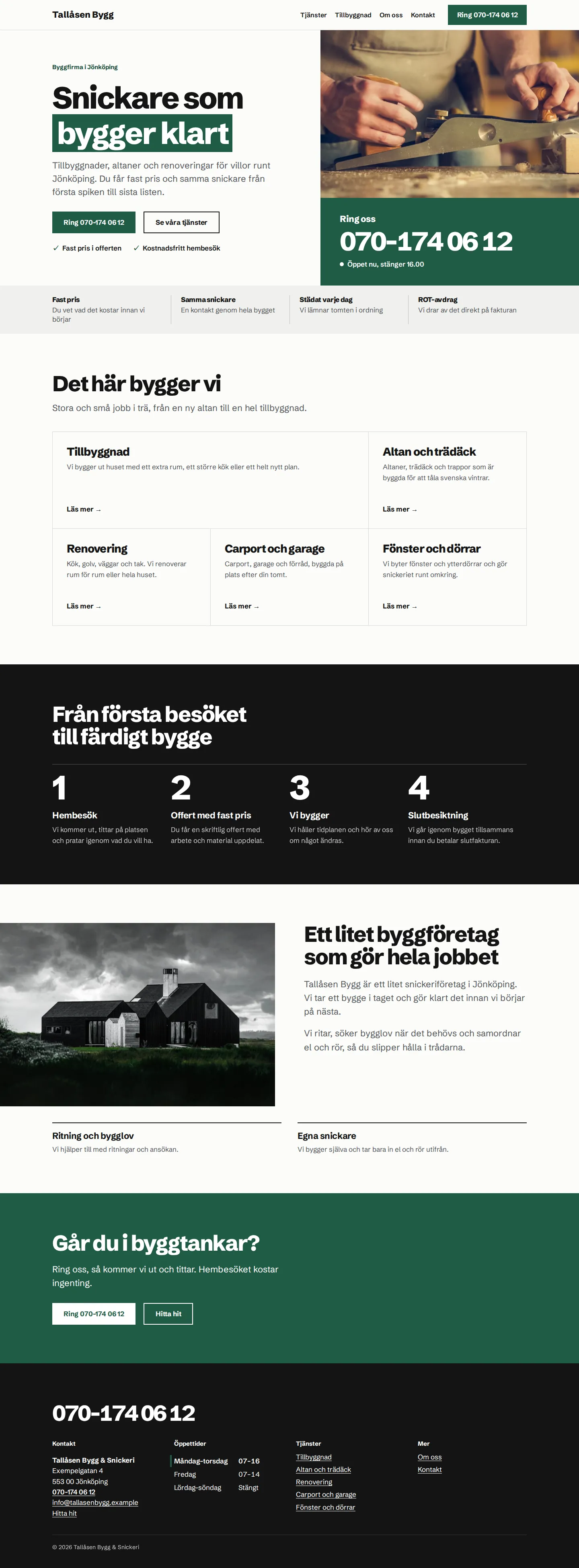

Scroll inside the image to see the whole page. The example shows a fictional company.
- Suits
- Building and roofing
- Strong brand colours
- Businesses that want to stand out
- Typeface
- Schibsted Grotesk
A website for builders and roofers
Skarp is designed for businesses that already have a clear brand colour on their vans, workwear and signs. The colour fills large areas of the website, so customers recognise the company from the building site.
The same features in every theme
Every theme is built in WordPress and designed for mobile. The phone number and address are clickable, contact details are changed in one place and the design is adapted to the company’s brand identity.
See everything included